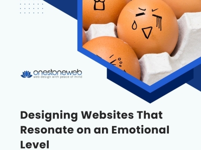
In an era dominated by the digital landscape, where countless websites vie for attention, the difference between a visitor staying or leaving could hinge on that all-important emotional connection. The burgeoning field of emotional design seeks to weave this connection into the very fabric of websites, turning casual browsers into loyal customers and avid fans. This comprehensive exploration delves deep into how web design can transcend the purely functional to engage users emotionally, creating experiences that are not just seen and used, but felt and remembered.
_thumbnail.jpg)
_thumbnail.jpg)
_thumbnail.jpg)
_thumbnail.jpg)
_thumbnail.jpg)